Telix Pharmaceuticals
Telix pharmaceuticals is a growing
player in the field of nuclear medicine and targeted radiation, and once they got their first product approval, it changed them from emerging
biotech to proven pharmaceutical player.
With a renewed positioning in being a patient centric company, we wanted the new look to feel safe, trusted, technological first and driven company for their clients.
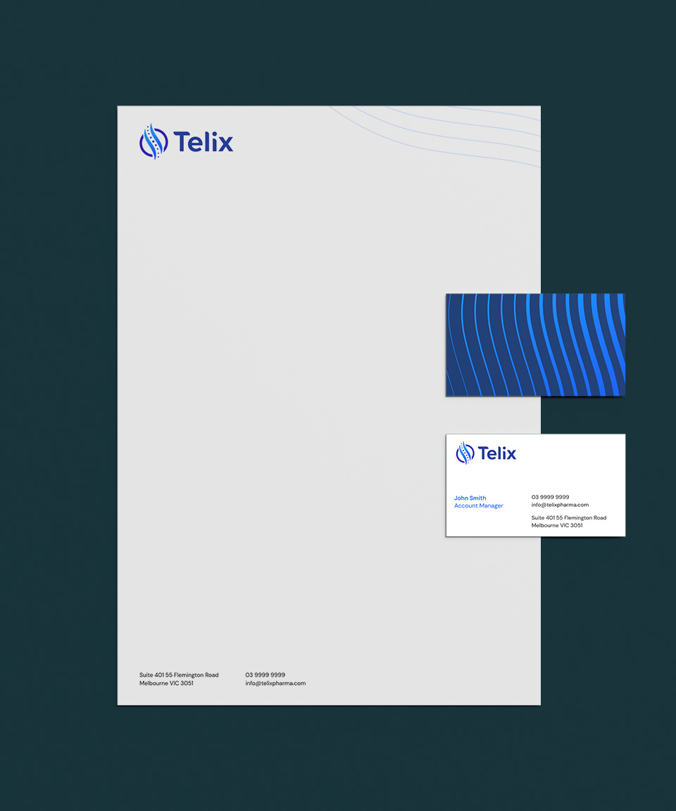
Staying true to the legacy of Telix, we kept the original curve and cells but elevated the mark by creating a bolder and simple icon. In doing this, the icon stands out on digital platforms and we paired it with a custom-drawn font. The curves and softness of the type pays homage to Telix’s patient-first ethos and the ever-changing medical landscape.
We created a flowing graphic device using the curves of the icon, which represents the body of DNA, which helps tie together imagery and colour, giving the assets a sense of positive movement and direction. We also updated the colours to a brighter palette, which shows up the brand as the new leader in radiopharmaceuticals.
From there we were tasked with developing the brand guide and corporate assets, plus 2 annual reports. I was also tasked with providing design counsel in the development of the new website.
Brand Identity.
Print and digital collateral.
2022-2023.
Work done at WE Communications


