Windana Refresh
Windana provides services across Victoria for adults and young people experiencing alcohol and other drug harms, family violence, mental health challenges, and social disadvantage.
They approached us at WE for a brand and strategy refresh as they transitioned to a new business model, consolidating multiple sectors under one umbrella to offer a holistic recovery approach. This new model emphasises an individual’s strengths, builds resilience, and enhances opportunities for social inclusion.
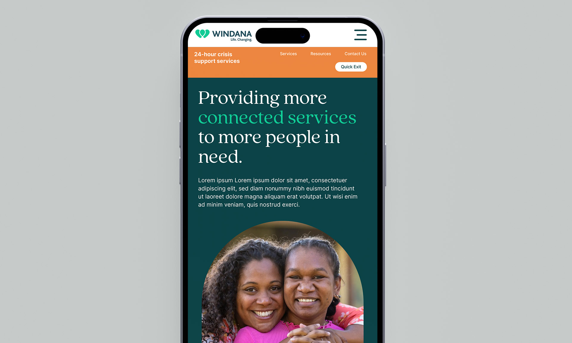
“Connect Care” is the brand mission we developed for Windana. This mission focuses on connecting families, communities, and healthcare teams to provide more integrated care and deliver more connected services to those in need.
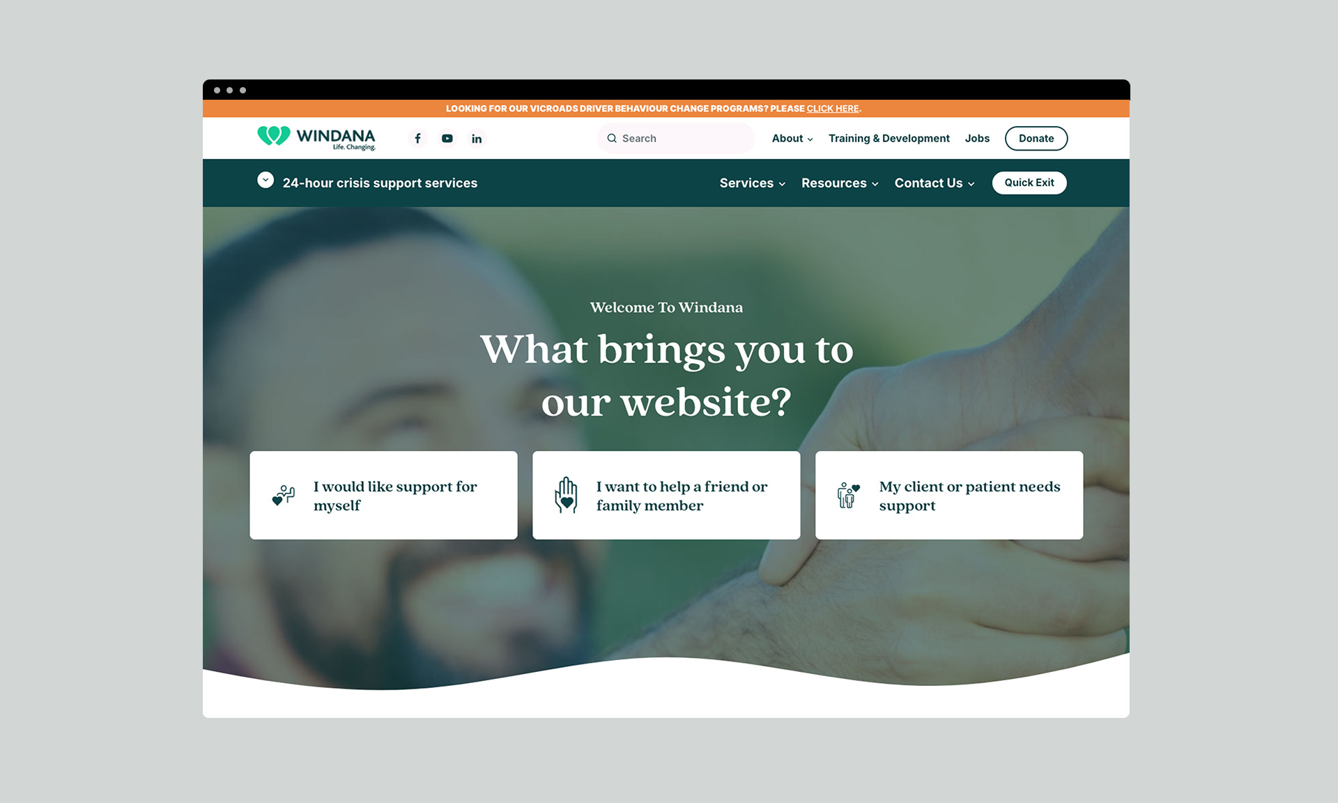
With the concept of connection at the core, I developed a design system using soft shapes and patterns to evoke a sense of calm, softness, and community. Given the seriousness of the topics Windana addresses, it was important not to intimidate or discourage people from engaging with the programs. The more holistic and friendly design approach aims to put patients at ease.
The color palette was chosen to convey calmness and, when paired with a playful serif typeface, helps Windana stand apart from the clinical appearance of other health service companies. The logo was also refined by softening the corners of the icon and text to align with the brand shapes, tightening the wordmark, and updating the logo configuration to better suit digital platforms.
Brand Identity Refresh.
Print and digital collateral.
2024.
Work done at WE Communications


